Ever wondered what happens when you mix red and green? Whether you’re dabbling in paints, working on a digital design, or simply curious about color theory, this question pops up more often than you might think.
The answer isn’t as straightforward as it seems; it actually depends on how and where you mix the colors. In the world of paints, red and green often combine to form a muddy brown, while in light, they produce a bright yellow.
Beyond science, these two colors have fascinating roles in art, design, and even culture, appearing in everything from festive decorations to digital screens.
In this guide, we’ll explore the science of color mixing, show practical tips for artists and designers, explain common misconceptions, and even share fun experiments you can try at home.
By the end, you’ll fully understand what red and green make and why it changes depending on the context.
Red + Green in Paints (Subtractive Mixing)
When it comes to mixing red and green in paints, the result is very different from what happens with light. In painting, we use subtractive color mixing, which means that combining colors absorbs (subtracts) certain wavelengths of light and reflects others. Red and green are considered secondary and primary colors in this system, and when mixed in pigments, they usually produce a brown or muddy color. This is because mixing multiple pigments tends to reduce brightness and hue intensity, leading to a neutral or earthy tone.
Artists often find this surprising, especially if they expect bright results like yellow or orange. The exact shade of brown depends on the tones of red and green used; brighter red with darker green may produce a warmer brown, while muted shades may give a duller, cooler brown. To avoid muddy results, painters sometimes adjust by adding a small amount of yellow, blue, or white to shift the hue or lighten the mixture.
Understanding this behavior is essential for painters, designers, and hobbyists alike. By mastering the principles of subtractive mixing, you can predict how your colors will blend, create harmonious palettes, and avoid unexpected dull colors. So, next time you mix red and green paint, remember: brown is nature’s default outcome!
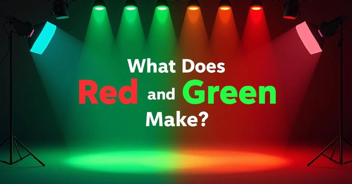
Red + Green in Light (Additive Mixing)
When we shift from paints to light, the rules of color mixing change completely. Unlike pigments, which follow subtractive mixing, light uses additive color mixing. In this system, colors are created by combining light wavelengths, and adding more colors actually increases brightness rather than dulling it.
When red light and green light are combined, the result is yellow light. This happens because the human eye perceives the combination of red and green wavelengths as yellow. This principle is the foundation of the RGB color model, which is used in screens, monitors, televisions, and stage lighting. Designers, photographers, and digital artists rely on this concept to create vibrant colors on digital platforms.
Understanding additive mixing also explains why red and green can appear so different in digital media compared to physical paints. While mixing paint yields a muddy brown, mixing red and green light produces a bright and vivid yellow, demonstrating how context completely changes the result.
For practical applications, this knowledge is crucial for lighting design, screen-based art, and visual effects. By manipulating red and green light intensity, you can achieve a wide range of yellow hues, from soft pastel tones to bold, bright shades. Additive mixing opens a whole new world of possibilities beyond the limitations of pigments.
Red + Green in Printing (CMYK)
Printing uses a completely different system from both paints and light: the CMYK color model. CMYK stands for Cyan, Magenta, Yellow, and Key (Black), and it relies on subtractive color mixing, like paints, but in a more technical way. When mixing colors in printing, red and green do not produce the same results as on screens or in painting, because inks absorb certain wavelengths of light rather than emit them.
In CMYK printing, red is typically created using a combination of magenta and yellow, while green is produced by combining cyan and yellow. When you try to “mix” printed red and green, the result is usually a muted brown or gray, depending on the exact ink tones. This is because combining multiple inks reduces light reflection and cancels out brightness, similar to mixing paints.
Designers and printers need to be careful with red and green combinations, especially for branding or packaging. Colors that look vibrant on a digital screen may appear dull or muddy once printed, due to these subtractive mixing properties. To maintain visual impact, designers often use spot colors or adjust ink ratios to achieve the desired hue.
Understanding how red and green interact in CMYK is essential for accurate color reproduction in printed materials. By knowing the limitations of subtractive printing, artists and designers can predict outcomes, avoid unwanted muddy colors, and ensure that red and green combinations look as intended in the final product.
Psychological & Cultural Meaning of Red and Green
Red and green are not only important in color science they also carry deep psychological and cultural significance. In many cultures, these two colors together are strongly associated with holidays and celebrations, especially Christmas in Western countries. Red symbolizes warmth, energy, and excitement, while green represents nature, growth, and calm. When combined, they create a visual contrast that is both eye-catching and emotionally impactful.
In design and marketing, red and green can convey specific messages. Red can trigger urgency or excitement, making it a popular choice for sales, while green suggests balance, health, or eco-friendliness. However, using them together requires care, because the high contrast can be visually overwhelming if not balanced properly. Designers often soften one color or introduce neutral shades to avoid eye strain.
Psychologically, red and green together can evoke feelings of harmony or tension, depending on context. For example, in traffic lights, red signals stop and green signals go, combining them in design can be confusing if misapplied. Artists, advertisers, and interior designers leverage this knowledge to create specific moods, highlight key elements, or evoke cultural associations.
Understanding the cultural and psychological impact of red and green enhances both artistic and practical applications. Beyond just “what color do they make,” these colors together influence perception, behavior, and emotion, making them powerful tools for creators and communicators alike.
Color Theory Tips for Mixing Red and Green
Understanding color theory is essential when working with red and green, whether in painting, design, or digital art. One of the most important concepts is the difference between subtractive and additive color mixing, which determines the final result when combining colors. In paints, red and green produce brown, while in light, they create yellow. Knowing this helps artists and designers predict outcomes and avoid unexpected results.
When mixing paints, it’s crucial to consider tone, saturation, and brightness. A bright, vivid red combined with a muted green may yield a warmer brown, while mixing two intense, pure colors often results in a darker, more neutral shade. To control the mixture, adding small amounts of yellow, white, or blue can shift the hue or lighten the color. Using a color wheel can also help identify complementary and analogous colors, ensuring your palette remains harmonious.
In digital design, red and green follow the RGB additive system, so mixing them produces yellow. Designers can manipulate brightness, saturation, and opacity to create variations. Tools like Photoshop, Illustrator, or online color pickers make experimenting with color combinations easier and more precise.
By applying these color theory tips, creators can master red and green combinations in any medium. Whether painting, designing a logo, or setting up stage lighting, understanding how these colors interact allows for better visual balance, aesthetic appeal, and creative control.
Fun Experiments for Kids & Learners
Mixing red and green is not just a scientific or artistic concept, it’s also a fun way for kids and learners to explore colors. Hands-on experiments help children understand the difference between subtractive and additive mixing while sparking creativity.
For a simple paint experiment, provide red and green watercolors or tempera paints. Ask kids to mix small amounts on a palette and observe the resulting color. They’ll notice that the combination often produces a brownish tone, teaching them about subtractive color mixing in a tangible way. You can also experiment with different shades of red and green to see how the outcome changes. Adding a touch of yellow or blue can create even more variations, reinforcing the concept of color adjustment.
For light-based experiments, use colored flashlights or transparent colored films. Shine a red and a green light on a white surface, and children will see yellow appear where the lights overlap. This demonstrates additive color mixing in a fun, visual manner.
These activities are perfect for classrooms, homeschooling, or at-home science projects, combining learning with play. Children not only understand what red and green make, but also grasp the broader principles of color theory, perception, and experimentation. Plus, experimenting with colors encourages problem-solving, creativity, and curiosity, making learning both educational and enjoyable.
Common Misconceptions About Red and Green
Red and green may seem simple, but there are several common misconceptions about what happens when you mix them. Many people assume that mixing these colors will always produce yellow, because that’s what happens in digital screens. However, this is only true in additive color mixing (light), not in paints or printing. In subtractive mixing, like with pigments or inks, combining red and green usually results in brown or muddy tones.
Another misconception is that the result is always the same. In reality, the shade and brightness of red and green can dramatically affect the outcome. A bright, vivid red mixed with a dark green may create a warmer brown, while muted or pastel tones may produce a dull, grayish color.
Some beginners also confuse complementary colors with predictable mixtures. While red and green are complementary on the color wheel, mixing them in paint neutralizes their intensity rather than creating a bright color. This is why painters are often advised to mix complementary colors carefully and in small amounts to avoid unwanted dullness.
Additionally, digital artists sometimes expect printed colors to match screen colors exactly. Due to CMYK printing limitations, red and green combinations in print can look muted compared to what appears on an RGB screen. Understanding these misconceptions helps both artists and designers predict results more accurately and avoid surprises in their projects.
Tools & Technology for Predicting Colors
Today, a variety of tools and technology make it easier than ever to predict what happens when you mix red and green. Whether you’re a painter, designer, or educator, digital tools can save time and help you experiment without wasting materials.
For digital artists, programs like Adobe Photoshop, Illustrator, and Procreate allow precise control over red and green combinations using the RGB color model. You can adjust opacity, brightness, and saturation to see exactly how colors interact on-screen, producing a predictable yellow result when mixing red and green light. Online color pickers and simulators can also help beginners visualize additive and subtractive color mixing.
For print designers, software like CorelDRAW or InDesign lets you preview CMYK outcomes, which is crucial since red and green inks often produce muddy brown tones. These programs can simulate printed colors on your screen, reducing surprises in final outputs.
Even for educators and kids, there are interactive websites and apps that simulate mixing paints or lights, helping learners understand the difference between additive and subtractive color systems. Tools like digital color wheels and virtual palettes make it easier to explore hundreds of combinations safely and effectively.
By leveraging these tools, you can experiment with red and green in any context: paint, print, or digital media without guessing. Technology ensures accuracy, efficiency, and a better understanding of how these two vibrant colors interact across different mediums.
Practical Applications of Red and Green
Red and green are more than just primary and secondary colors; they have practical applications in art, design, and everyday life. Understanding how these colors interact can help create visually appealing and effective results in multiple contexts.
In interior design, red and green can add vibrancy and balance to a space. For example, red accents like cushions or artwork combined with green plants or wall tones create contrast and energy. However, care must be taken to avoid overwhelming the eye; using neutral colors like white, beige, or gray can help balance the combination.
In fashion and branding, red and green are often used to evoke specific cultural or emotional responses. Clothing designers use these colors for holiday collections, while marketers use them to grab attention and convey messages of excitement (red) and growth or eco-friendliness (green).
In graphic and digital design, understanding red and green mixing is essential. On screens, they produce yellow, allowing designers to manipulate color for backgrounds, icons, and effects. Meanwhile, in printing, the combination often yields brown, so designers adjust inks or use spot colors to maintain vibrancy.
Even in holiday decorations, product packaging, and educational materials, red and green are widely used. By knowing how they interact in different mediums, creators can make informed decisions, ensure visual harmony, and evoke the desired emotional or aesthetic response.
Interesting Facts & Trivia About Red and Green
Red and green are not only important in art and science they also have fascinating trivia and historical significance. For starters, red and green are complementary colors on the traditional color wheel, meaning they sit opposite each other and create strong visual contrast. This is why they are so striking when used together in design, fashion, or decorations.
Historically, red and green have been significant in art and symbolism. In ancient cultures, red often represented power, courage, or life, while green symbolized nature, fertility, and growth. Combining these colors has conveyed important messages in murals, textiles, and heraldry for centuries.
In science, red and green are key to understanding human vision. The human eye has red and green cones that detect color, which is why mixing red and green light produces yellow in additive color theory. Interestingly, people with red-green color blindness may perceive this combination differently, highlighting how perception can vary.
Another fun fact: red and green are the traditional colors of Christmas, but this wasn’t always the case. The modern association originated in the 19th century and has since influenced design, marketing, and pop culture.
Even in everyday life, red and green play important roles from traffic lights to holiday decor showing how these two colors continue to shape culture, psychology, and design. Understanding these facts adds depth to the simple question: “What does red and green make?”
FAQs
When it comes to red and green, many people have questions about how these colors interact. Here are some of the most frequently asked questions and their answers:
1. What color does red and green make in paint?
In painting, red and green are mixed using subtractive color theory. This usually produces a brown or muddy color, since combining multiple pigments absorbs more light and reduces brightness. The exact shade depends on the tones of red and green used.
2. What color do red and green make in light?
In additive color mixing, which applies to digital screens, LEDs, or stage lighting, red and green light combine to form yellow. This happens because the human eye perceives the combination of red and green wavelengths as yellow.
3. Why do printed red and green colors look different?
Printing uses CMYK inks, which are subtractive. When red and green inks are combined, the result is often a muted brown or gray, not the bright yellow seen on screens. Designers must adjust ink ratios or use spot colors to achieve vibrant results.
4. Can red and green ever make a bright color in paint?
It’s difficult, but adding other colors like yellow or adjusting saturation and brightness can slightly brighten the mixture. Otherwise, the default result is usually brown.
5. Why are red and green used together in culture?
They are visually striking due to their complementary nature and are often associated with holidays, celebrations, and nature, influencing design, marketing, and art worldwide.
Understanding these FAQs clarifies the differences between mediums and highlights the fascinating versatility of red and green across science, art, and culture.
Conclusion
Red and green are two of the most versatile and fascinating colors, but what they make depends entirely on the medium and context.
In painting and pigment mixing, red and green combine to form brown, a result of subtractive color mixing that absorbs light and reduces vibrancy.
In contrast, in light or digital screens, they create yellow due to additive mixing, where light wavelengths combine to form new colors.
Printing adds another layer of complexity, as red and green inks in CMYK often produce muted brown or gray tones rather than bright, vivid hues.
Beyond science, red and green hold cultural, psychological, and artistic significance. They are complementary colors that evoke strong contrast, appearing in holiday decor, fashion, branding, and even traffic signals.
Their combination can symbolize excitement, growth, celebration, or attention depending on the context. Understanding these interactions allows artists, designers, and learners to predict outcomes, avoid mistakes, and use colors effectively in both creative and practical applications.
Whether you’re mixing paints at home, designing a website, or creating stage lighting, knowing what red and green make is both fun and educational.
Hands-on experiments, digital tools, and knowledge of color theory can help you master these combinations. Next time you ask, “What does red and green make?” you’ll not only know the answer but also understand why it happens, giving you confidence to explore, experiment, and create with these vibrant colors.

“Hi, I’m Gigi Giggles! Spreading laughter and good vibes wherever .I go Lover of silly jokes, random adventures, and all things fun. Life’s too short to be serious, so let’s giggle, smile, and make every day a little brighter .Check out more puns and laughs at thepunside.com!